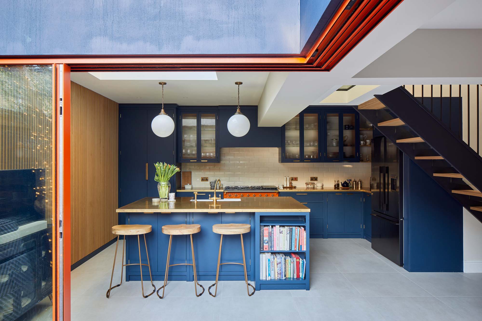
The result? A fusion of bold design and period vibes – making this family kitchen the lead role and centre stage of the property.


The buzzing West London suburb of Shepherd's Bush is home to this month’s interior inspiration – a family of six living in a recently renovated five-bed Victorian terrace. The property – built in an architectural style typical of the period and the area – was originally one home, but at some point the terrace property had been divided into two separate living spaces. As the family was already living upstairs, as soon as the ground floor flat came onto the market, they decided to buy it.
Having acquired the property they set about converting it back into a more spacious home for their family of six. The new space allowed them to undertake a complete renovation of the kitchen and create their perfect family kitchen-dining space.
The family's vision for their perfect kitchen-dining area was a versatile space and sociable area for eating, cooking and entertaining. They really wanted it to feel like their favourite place to socialise – cosy and comfortable, yet still hip and effortlessly cool. They were really inspired by the eclectic style of the original Grade II-listed Soho House on Greek Street, as well as the Riding House Café in London, and wanted to incorporate some of the key design elements found in these spaces into their new kitchen.

One of the features that they admired and enjoyed about both venues was the bold use of period colours, which they wanted to introduce into their own home.
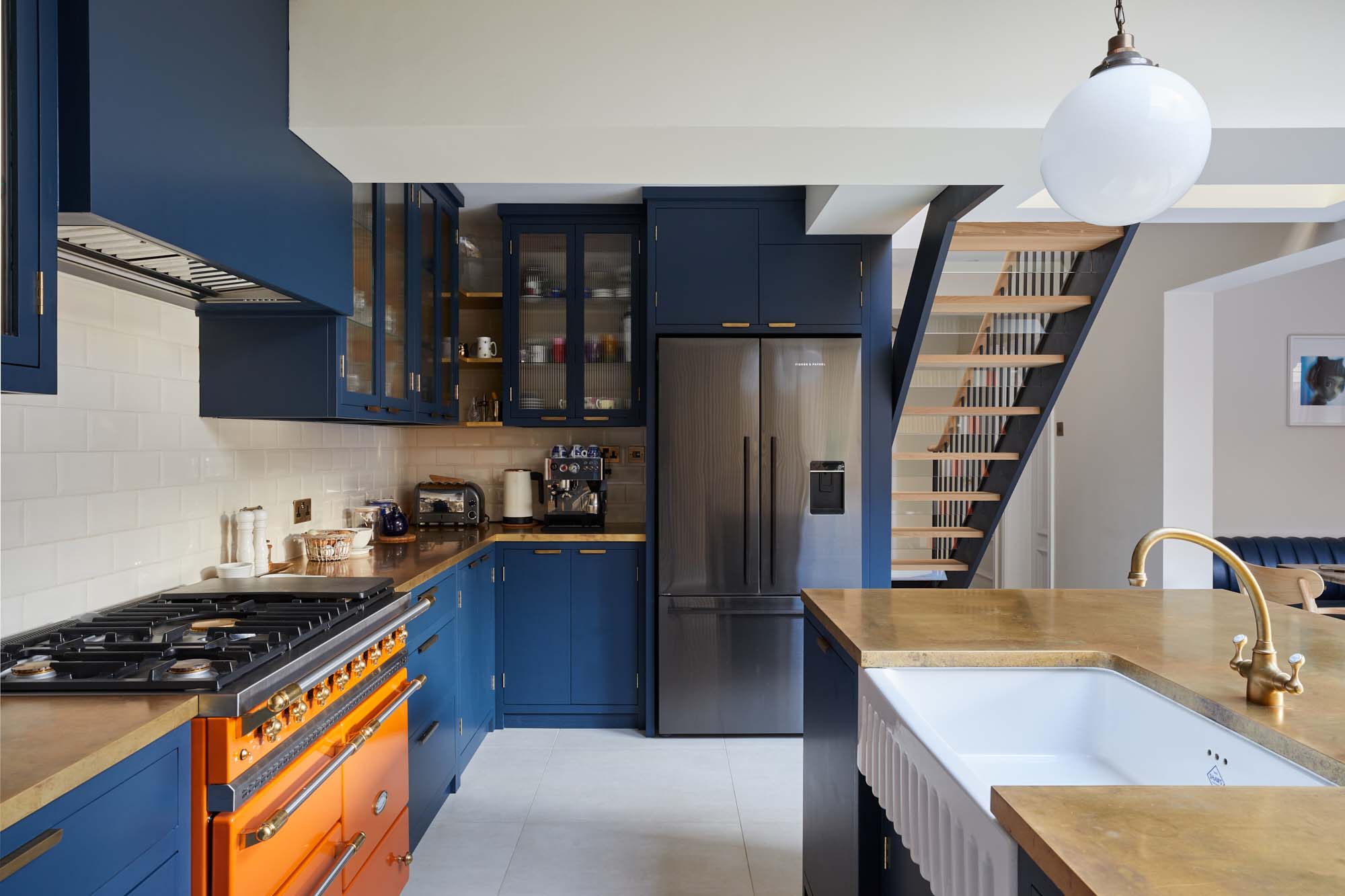
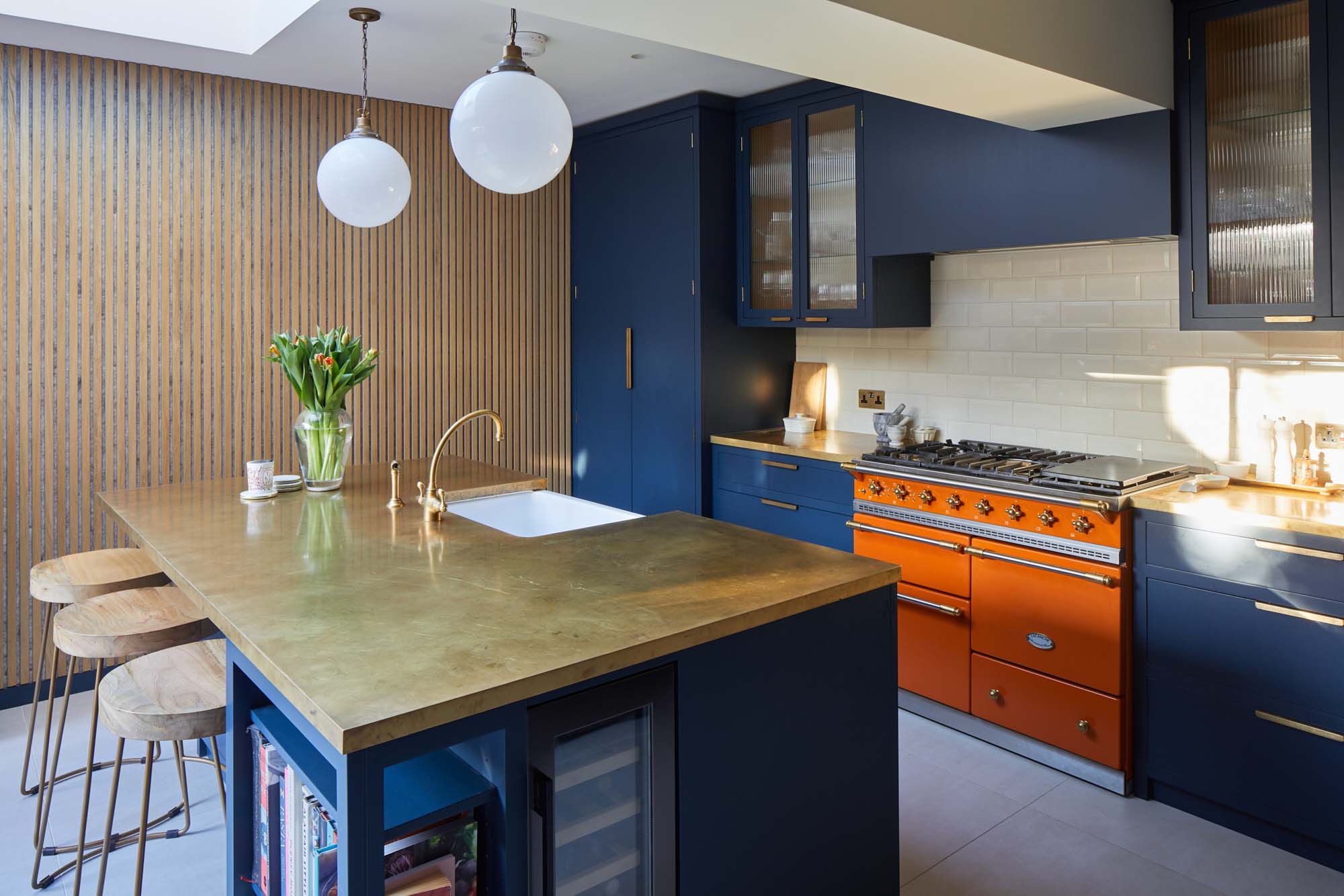
The shade of bold blue is matched perfectly to the external frontage of the Riding House Café, and the use of the wildly contrasting mandarin-coloured Macon Classic dual-fuel range cooker from Lacanche, is inspired by the playful, homely aesthetic made famous by Soho House. The homeowners chose bright orange windows to match the stove, and the natural brass worktops from Modum Worktop add texture and warmth as they softly shimmer – as if finished in gold leaf. The kitchen cabinetry is a smooth-fronted simple design that allows the colours to take centre stage.


The Bowland 800 was chosen for its distinctive fluted design and generous size which affords plenty of space for everyday tasks. The fluted apron design of the fireclay sink also pairs beautifully with the glass fluted wall cabinets that sit behind it, with the slatted Oak panelling further adding to the theme of vertical lines. As a frequently used part of their kitchen, for both washing up and socialising, the homeowners wanted to ensure the sink was as central as possible, whilst also being able to face and enjoy the view of the garden. Finally, the simple white, utilitarian Victorian Metro tiles pay homage to the building's heritage.
The result? A fusion of bold design and period vibes – making this family kitchen the lead role and centre stage of the property.
With thanks to The Main Company and Chris Snook Photography.